Common UX Mistakes (and how to fix them) – Part 1: Cluttered Design
July 17, 2018 8:26 pmThis is the first in my multi-part series on common issues I see that create a poor User Experience (UX) on websites. The series will cover some pretty big issues that will cause visitors to leave your website. If someone opens your site then goes back to their Google results page, you’ve just lost a customer.
 The Issue: Too Much Clutter
When it comes to webpage (or any) design, you can’t just cram as much as you can possibly fit on the page. I see this a lot in both print and web design, it seems like people think the more info you put on a page the more info people will absorb. That is the exact opposite of what will happen.
We can easily go down the rabbit hole of Hick’s Law, a psychology principle that describes the time it takes for a person to make a decision based on the number of possible choices he or she has (ie: increasing the number of choices will increase the decision time). Shouldn’t be too shocking to most people.
Clutter, however, goes beyond just a number of choices. Once you try to use every inch of “real estate” on a screen or page you begin to create a feeling of chaos. Take a look at the image in this section to see what I mean. Sure, this company has a lot of products right in your face as soon as you load the page (at least I guess that’s their justification). But, how easy is it for your eye to navigate that page?
Obviously, this is an extreme example, but take a look at Apple.com for contrast. Apple’s designers are masters of stripping away unnecessary clutter. Can you tell what’s important on their site? Can you easily figure out where to find what you came for (and maybe some cool stuff you didn’t come for)?
The Fix:
So, how do we fix this scenario?
Pick the focus
First, spend some time really thinking through what your visitors are most likely coming to see/learn/find on your site. Now, decide what you want the focus to be on your site. Get rid of almost everything else. Before everyone starts email me, obviously there are other aspects you’ll need but probably not as many as you think.
 Create Visual Groups of Objects
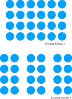
Second, start grouping things together visually. This relates to another psychology principle called the Law of Proximity. This one states that our brains naturally associate things that appear in proximity to one another. See the circles example, there are exactly the same number of circles in each image but while the first image seems like one big jumble of dots, the second looks more like three smaller groups. If you had to pick a single dot from one of these images which one do you feel is going to be an easier choice?
Take advantage of this by creating visual groups that you want people to associate. For example, if your visitors tend to come looking for Item A but you want them to see Item B and C. Start associating them by putting B and C nearer to A. Add some whitespace between the three and other items on the page. The negative space has the added advantage of giving a viewer’s eye the change to rest.
Create a Visual Hierarchy.
The third and final point is to create a hierarchy visually. That means to design your page with a main focus in mind, then a secondary, then a tertiary, etc. Using a couple simple design techniques, its easy to create a dominance for your most important items by emphasizing them over lesser objects.
Size can be helpful here, we tend to perceive bigger objects as more important and can even ignore items that are too small. It’s not a coincidence that the fine print is super small, it’s so less people will read it.
A second way to create a sense of importance is the objects position on the page. With web design especially, anything a visitor can see before they have to scroll is going to be perceived as more important. We used to call this “above the fold” in newspaper layouts.
We can also create dominance with contrasting colors. For example, if you have a mostly white page, making one section or object black or very dark can give that item more “weight” and draw extra attention. The inverse holds for a light area in a dark design. Colors like red, orange and yellow can catch more attention as well but use loud colors sparingly please.
Categorised in: UX
